If you’ve been following the trials and tribulations of this writer’s efforts to prepare for the possibility of indie publishing his novel, you might have predicted that the fourth version of his manuscript would not be the final one for very long. And you would have been correct.
Although Microsoft Word is adequate for producing a file that will be converted to .pdf for uploading to Amazon’s CreateSpace, the following quote from Build Your Book by Walton Mendelson got my attention:
I assume you are are not going to learn a desk top publishing application like Adobe’s In-Design. If you have Word or Open Office you can convert your manuscript into a book. Desktop publishing software creates pages with more typographical control than a word processor, more stability, and easier to export to PDF, but you need to consider the learning curve.
Okay, so Walton assumes that the steep learning curve associated with Adobe InDesign (not to mention the price) would steer most of his readers away from trying to use it. On the contrary, that reasoning made me curious to know how much better InDesign is than Word. How much more control over layout does it provide? What other functions are included that Word doesn’t even try to do?
To answer these questions, I downloaded a 30-day trial of In-Design CS5.5, opened it up and marched boldly into the wilderness. Five days later, I have a nice-looking document with all the essentials required in a properly formatted book. That said, I’ve barely penetrated the InDesign Outback. There are menu options and icons on the workspace that might as well be labeled in Lorem Ipsum. (See the previous post in this logbook for the significance of that statement.)
Leaving aside the capability of converting files to .epub format (which I’ve already done with an application called Calibre), and all the tools for creating a wrap-around cover for the trade paperback edition of the novel, InDesign offers a mind-boggling array of controls for manipulating the characteristics of text that result in very different visual presentations, and by that I mean the overall appearance of the block of text on the page (the macro view) as opposed to the reader focusing on the individual words in a sentence.
I’ve only used a tiny fraction of the fonts on my computer or available for download from the Internet. Luckily, the number of fonts suitable for large blocks of text narrows the choices, and my guess is that an even smaller group includes the fonts most commonly used by professional designers. Proven popularity over the years has a lot to recommend it.
According to a writer friend who knows far more about this than I, guidelines exist for the most readable combinations of margins, font, size, leading (pronounced led-ing, which in layman’s terms is the space between two lines of main body text), and the font type, size, and style for headings to set them off from the main body text. And although I can teach myself to manipulate all these variables with the application, technical facility with the tools has no relationship to the artistic sense required to choose one combination over another and know why.
I’d expect the non-professional like myself to create a final layout based entirely on what “looks good.” I know many more writers than graphic designers, and although to ask for the opinions of other writers on page layout is a lot different than asking for help with the manuscript, I plan to do that for the same reasons: both variety and consensus of opinion are valuable inputs.
Two comments from one fellow writer (who also has extensive experience with interior book layout) have gained my attention: the outside margins need to be increased slightly to create more edge white space, and the gap between the top of the main body text and the header is a bit too tight. I think both of these are valid observations and deserve careful consideration.
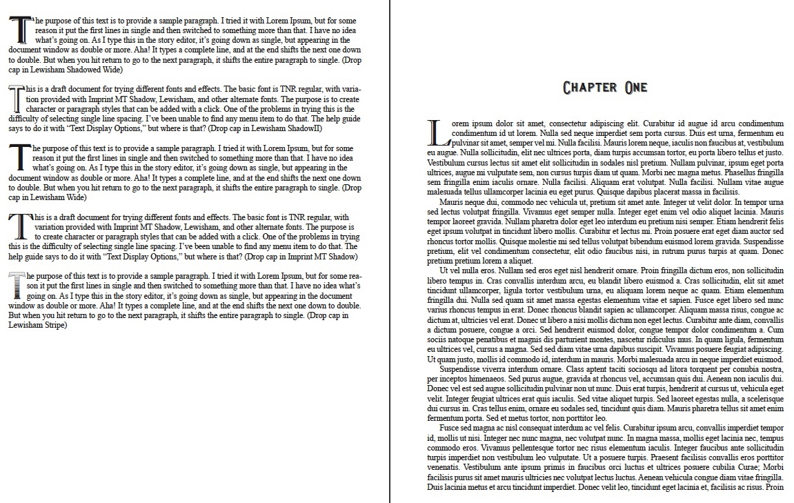
The original Word document imported to InDesign used only Times New Roman font and relied on application of character attributes and font size to achieve visual differentiation between headings and the main body text. Header text and page numbers employed bold and small caps, chapter headings did as well plus increased font size, and the first paragraph of every chapter began with a “drop cap” with bold and a shadow effect.
When I imported that file into InDesign, the shadow effect available in Word disappeared. I really like it, but InDesign doesn’t offer a suitable alternative within the application that I can apply to an existing font. The only option was to search for another font with the effect embedded in the font to begin with. An Internet search proved almost overwhelming. I had no idea how many choices were available. Most weren’t suitable, but I still had to search though them to find one that might be.
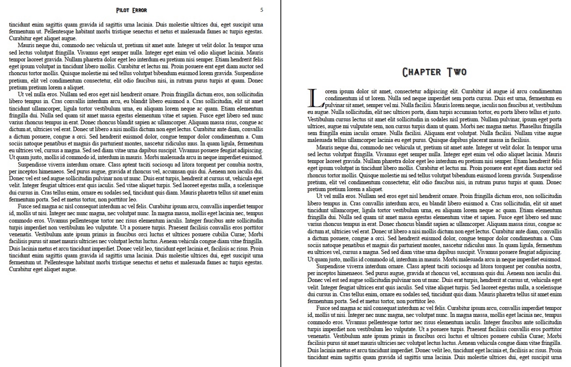
Two choices made the most-wanted list: Imprint MT Shadow and Lewisham Shadowed, which also turned out to be a small-cap font with the capital letters using the caps lock extending above and below the small caps. I really like this effect and used it for the chapter headings, header text, and page numbers. Imprint MT Shadow looks really good as the drop cap.
To illustrate the differences, here are three screen shots of a document for looking at fonts and character styles merged with sample Lorem Ipsum pages formatted the same as the current novel.
Note: Click on the images for a larger view and use the back button on your browser to collapse it.


