Okay, so here I am trying to balance my time around four parallel efforts: maintain the blog, continue submitting my novel to agents, dust off two other manuscripts, and research “ebooking” under the assumption that I’ll end up working my way through a list of 157 possible agents either without being offered representation or an acceptable publishing contract.
In yesterday’s post I addressed (superficially, because I haven’t begun as yet) the task of formatting my novel into an ebook. I can report a little progress in deciding that with more time than discretionary income to invest in this project, I’m going to try to do it myself. Many of the tasks required for interior layout are at least somewhat familiar to me, but cover design taps into a brand new world.
Barry Eisler’s blog has two very informative posts on the task of creating ebook “packaging,” which he defines as choosing the title and cover design. His example uses the Italian version of his second novel, Hard Rain, which has a different cover (and title) than the original English version. The contrast is striking.
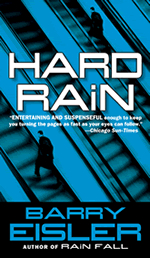
 Here is the original edition cover (chosen by his legacy publisher, I assume, since authors are never given final authority on title and cover design). The main character’s last name is Rain. He’s an assassin, so the title might be construed as differentiating between a gentle rain and a downpour, but the mental image is still that of rain. And the cover shows a man on an elevator.
Barry’s blog post on packaging discusses automatic and acquired resonance. This cover has little of either.
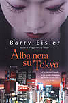
 This is the Italian version. His blog post compares the two versions by pointing out how much better this one is. Here’s what he says:
What do we get from the cover? An Asian metropolis (probably Tokyo, even if you can’t read the Japanese building signs, and even if there was any doubt, the title clarifies it), large, impersonal, vaguely intimidating and even threatening. Above it, a beautiful geisha, implying again the exoticism of the setting, and also hinting at romance and sex. And ambiguity – is the woman, who is looking down at the city, an angel? Or somehow malevolent?
One of the things I love best about this cover is how personal it is. There is a human being in the picture. There’s something intimate, alluring, even arresting about this.
And, of course, the composition plays beautifully with the title: “Alba Nera su Tokyo” (“Black Dawn Over Tokyo,” if my Italian can be trusted). Garzanti, the publisher, is emphasizing the setting on three levels: the image of the city, the image of the woman, and in the title itself. This is a strong, unambiguous statement: we have a book set in Tokyo. Certainly, like all sound branding, this brand will not be for everyone. But the point is not to try to appeal to everyone (such attempts, which in the end always wind up standing for nothing, tend to fail); it is to appeal powerfully to an approachable core constituency from which we can build by word of mouth.
So: “Alba Nera su Tokyo” accurately and elegantly emphasizes setting, suspense, and sex – at least three of the four elements my editor and I keyed on. The hinted-at information makes you feel a certain way about the book. No wonder the cover works so well. Bravo.
I think Barry’s explanation captures the essence of his point about the concept of resonance: the ability to evoke or suggest images, memories, and emotions.
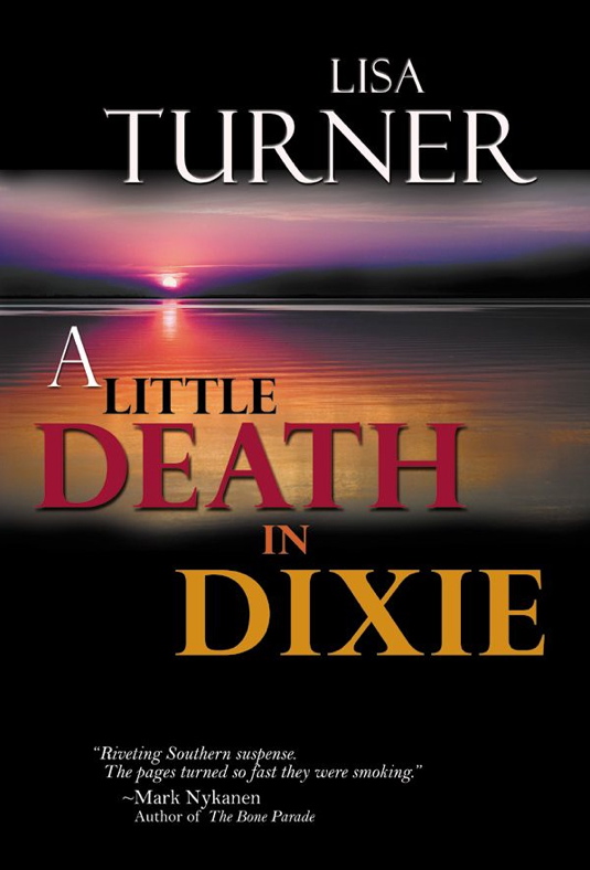
As part of my research into ebooking, I’ve visited the Kindle Store and downloaded a number of samples from the mystery/thriller section. When viewed on my Kindle for Mac application, I can study the cover and interior layout to get ideas. The cover and title below really caught my eye. I can’t analyze the reason with the depth of Barry’s explanation, but there’s something about the sunset over the water, the combination of colors, the juxtaposition of Little and Death, and the alliteration of Death and Dixie that resonates with me. It also suggests the heat and humidity of mid-summer in the deep South.
 I have no idea how a legacy publisher might feel about my title Pilot Error, but even stripped of my obviously biased viewpoint, it’s a very good title. Readers, of course, will initially react to the title without much if any knowledge of the story, and using Barry’s criteria of resonance, I think it works.
Most readers won’t be pilots (or at least I hope I haven’t written a novel for an audience consisting exclusively of aviators), and I would expect the vast majority of them to experience a gut reaction to the idea of their pilot making an error. Gulp. Kinda hits you where it hurts, doesn’t it?
But this post is about covers, so how do I best tie the resonance of the title to a visual image? My initial idea is to link the cover directly to the novel’s inciting event, in which an airplane slams into a mountain. Potential readers will (I hope) look at the cover and immediately think Oh —-!
To elicit that visceral reaction, I envision the view from inside the cockpit out the windscreen filled with nothing but trees and rocks. Where they are definitely not supposed to be. I found this image last night, which offers an example of what I’m considering as the starting point.
 This photo puts you in the cabin as a passenger looking past the pilots out the windscreen at an everyday occurrence. The airplane is lined up with a runway on what appears to be a normal approach to landing. You can relax, the flight is almost over. No more turbulence, strange clunking noises, bells and horns going off up there that you have no idea what they mean and don’t want to know. Your attention to the present has been hijacked by the intense desire for an adult beverage.
Now picture this photo when it’s ready for the cover. The entire view past the windscreen is filled with a tree-covered mountain, and the title Pilot Error is appears at the top. Shudder.
I’d love to be able to do this myself, and maybe I can. I’ve asked friends about it, and they tell me that professional design software isn’t cheap. But even if I spent the dollars on the program and learned how to use it, there’s no way to predict if I have the artistic sense to guide my decisions. (Did you get it? Dollars and sense?)
Part of my dilemma is that without yet being committed to the ebook option, I’m reluctant to invest in the software. In the meantime, I’m going to investigate the possibility.
Wish me luck, and stay tuned for news from the world of ebooking.


3 Responses to Ebooks – Covers