
Featured Images and Site Navigation
 When I first began the process of launching this website on a blog platform, my friend and fellow writer Deanna Roy suggested that before we sat down to build it, I needed to have content ready to publish and have chosen a few themes I might like to try. Compared to writing the posts, looking through hundreds of themes was like trying to find the one perfect word and beginning at the first page of a dictionary.
Although blogging is far more about the writing than the appearance of the page, I found that predominantly white themes have a greater chance of presenting a cookie-cutter look than those with some color. In my opinion, a blogger achieves the best of both worlds if a page that is visually appealing can at the same time present content effectively.
“A New Look” and “A Newer Look” posts go into detail about the reasons for installing my new theme in the place of Motion. “Header Headaches” and  “Header Aspirin” discuss the trials and tribulations of trying to find the “perfect” header image. For any readers knowledgeable about working in the “back pages” of a website, what follows is not an attempt to tell you anything new. It’s nothing more than my personal observations about entering the world of blogging and related “on-the-job training.” With that caveat, here goes:
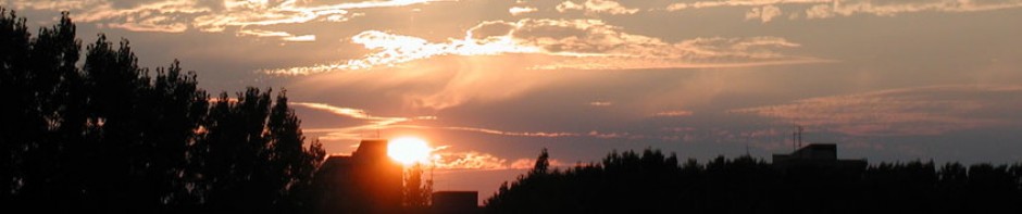
Header images play a crucial role in appearance because of their position on the page and size in relation to other images that might be inserted into the posts. A visitor’s eyes are naturally drawn there when the page loads. While solving the problem of uploading the header from the WordPress Fighter theme into my 2010 Weaver, I discovered in the main options pages a description of a function called “featured image.” Although I’d seen it before, I never took the time to check it out. That changed earlier this week, and I’m glad it did. Featured images significantly enhance the appearance of this site.

The process of inserting a featured image begins with a high resolution photo. Most photos are square (or close to it) or a rectangle. But featured images have to be about five times as wide as they are tall so they fit into the “header area” as defined by the theme. Once imported into iPhoto, for example, the image can be cropped to the correct size. This process also allows selecting the area of the photo you want to appear in the cropped image, and this “zooming in,” or magnification of a portion of the original image, is why it has to be high resolution. Otherwise, the end product will be fuzzy and appear out of focus. The insert below has been cropped to the correct proportion from a relatively low resolution photo. Put your pointer over the image and click for a larger image to see what I mean. Close the new window to return to this page. Then try that with the image above this paragraph to see the difference.

Once you have an image ready, it can be inserted into a particular post or static page. An “insert” will put the image within the body of the post text. But designation as a featured image alters the location depending on two options available on the main options page of the theme.
One option inserts the featured image in three locations: the header for that post page, within the body of the post at the top prior to any text, and a thumbnail at the top left corner of an excerpt of that post on any page where excerpts are used. More on excerpts in a moment.
The second option adds the featured image only in the header and on the excerpt pages. I chose this option, and the result offers visitors more variety in the appearance of the site and assists with navigating between the logbooks and pages, because post header variation can provide an immediate “in your face” visual cue that you have arrived at a new page. Significance of the word in bold italics is explained below.
 The image above is distorted because it’s a screen grab converted to .jpg and shown at full size, but it will serve to illustrate the point that visitors most often arrive at any website on the Home page. In the case of a website on a blog platform like this one, the Home “page” is really a series of pages, each with multiple posts, beginning with the latest at the top and descending “in time” below the bottom of your computer screen.
If you navigate with the scroll bar to the bottom of the first Home page, a link to older posts brings up another Home page with more posts. On any intermediate Home page, links to both earlier and later posts appear for convenience. But no matter where you are in the chronological ladder, the fighter pilot header image always tops the pages. In addition, the menu bar immediately below the header will show a darkened HOME as a reminder of where you are.
Here’s a useful site navigation tip: the title of each post on any Home page links to the unique page dedicated to that post. One click takes you there, and if I have selected a featured image for that post, the image will appear as the header for that page and provide a visual cue of the change. The screen-grab image below shows the result of clicking on the black Header Aspirin title (on the real Home page, not the grabbed image shown above) to bring up the single page dedicated to that post. Note also that the title of any post on its dedicated page (as shown below) is in blue.
And here’s the really cool part. When you are viewing any page dedicated to a post, every other post on this site is figuratively laid side-by-side chronologically, older to your left and later to your right, without regard to the logbook under which they are filed. And the logbook location for the post you are currently viewing is indicated in the menu bar below the header in darkened print.

Even more cool, links at the top and bottom, left and right corners of any post-dedicated page take you to the previous post or the next one. The associated logbook location for that post will also appear darkened. On the actual page shown in the illustration above, a click on “Header Headaches” with the arrow would take you to the previous post in chronological order and BLOGBOOK would remain darkened in the menu bar because both posts are filed there.
I promised more on the excerpt pages, and here it is: unlike my previous theme, 2010 Weaver provides logbook and archive listings in excerpted form. For each post, only the first 100 words will be shown with the title. You can click on the title or the continue reading link at the end of the excerpt and arrive at the page dedicated to that post.
And here’s another cool result of featured images: as shown below in the screen grab of the BLOGBOOK archive, to the left of the excerpt appears a thumbnail of the featured image associated with that post. This adds color to the excerpt pages and again serves as a visual cue for the header to expect when you arrive at the page for that post. Any excerpt without a thumbnail means I didn’t set a featured image for that post, or I haven’t yet gotten around to it.

I’m in the process of adding featured images to most of the posts. The fact that I changed to this new theme after blogging for so long and discovered the advantages of featured images with 156 posts already “in the can,” I’ve got my work cut out for me. I’d better get to it.
In the meantime, if you have an opinion on site appearance, I’d appreciate hearing it.
Comments
Featured Images and Site Navigation — No Comments
HTML tags allowed in your comment: <a href="" title=""> <abbr title=""> <acronym title=""> <b> <blockquote cite=""> <cite> <code> <del datetime=""> <em> <i> <q cite=""> <s> <strike> <strong>