Dispatch From the Indie Front Lines – More Cover Battles
If any of my fellow Texans are viewing this post as a single dedicated page (rather than on the Home Page with the fighter pilot header), I’ve set the featured image to remind you what water looks like. I’m not confident that it will ever rain again. If the fighter pilot is giving you the eagle eye, click on the post title.
As noted in an earlier post, my brother and I call it The McIntosh Brothers’ Pandora’s Box Syndrome, referring to the manner in which something that appears to be a relatively simple task will suddenly expand out of control. The inevitable result is to learn far more than we ever wanted to know. And while this particular case involves a topic I do want to explore in more depth, I had no idea of what I was getting into.
 The backstory is that I had completed every step in preparing my novel for the possibility of indie publishing as an ebook and trade paperback with one exception: the wraparound cover for the print-on-demand edition. My post on August 3rd deals with this adventure into the strange new world of Adobe InDesign (ID), a professional quality graphic design software. I had used a 30-day trial version to explore its capabilities for interior layout and cover design, and the time fast approached when I either had to buy it or accept the fact that it would become a virtual “boat anchor” on my hard drive.
One of the reasons I’m trying to do this myself is to minimize the up-front investment on the way to becoming an indie publisher, and two key questions now drove the decision of whether to purchase the software: Is the InDesign interior layout that much better than the Word version? Can I design an equivalent wraparound cover using Photoshop Elements (PSE)?
 As for the interior, even with only having scratched the surface of ID’s capabilities, I felt that its version presented an overall better appearance. In addition, this won’t be the only book I’ll publish, and I should improve my layout skills with more experience. The wraparound cover presented a different problem because I hadn’t yet tried to design it using PSE.
Before tackling that, I decided to confirm the cost of purchasing ID. I’d taken a quick tour of online stores before I began the trial and thought I had a ballpark figure, which turned out to be a wishful thinker’s pipe dream. Considering the retail price and with less than a week to go on the trial, the only way to solve my dilemma was to explore PSE further.
One revolting aspect of learning is to discover that if you’d only asked the right question to begin with, you could have avoided a massive headache. This instance qualifies as a poster child for failure to do that.
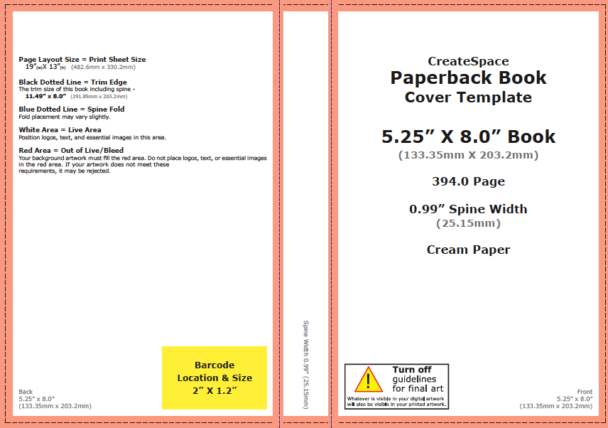
 It turns out that in addition to interior templates, CreateSpace (CS–Amazon’s print-on-demand publisher) offers cover templates. You enter your choice of finished trim size, black and white or color interior, with or without “bleed,” the number of pages, and white or cream paper. The template builder produces two files, a .pdf and .png, which you can download and open within either ID or PSE. I’d already built the cover in ID, so I concentrated on the latter. A brand-new world opened up.
One of the key functions of PSE is the concept of layers, sheets of transparent paper upon which you can put text or images, illustrations, graphics, etc. I’d already worked with layers in designing the ebook cover and the individual parts of the wraparound cover. But now, with the template in place as the first (or bottom) layer, I copied and pasted my front and back covers and spline on top of the template using three additional layers. How cool is that?
What’s even cooler is that by bringing the template layer from underneath the other three layers so it’s lying on top, I can view the position of each component of the cover in relation to what are called “safe” areas that must be free of any text or other objects. This keeps “live” elements clear of the edges of the cover and the fold edges where the front and back covers meet the spline.
 Let’s say I find that the title on the front cover is too close to the edge. All I have to do is select that text layer and activate the Move Tool. This puts a bounding box around the title. (The screen grab below doesn’t show the template, but the bounding box is visible, especially if you click on the image to enlarge it. Return to normal view with your browser’s back button). I can use the tool to drag the box where I want it, or better yet, with the arrow keys move it vertically and laterally in very small increments. The relationship of the text to the safe areas can be viewed in real time. Very handy.
 At the end of the day, it became apparent that I could have used PSE from the very beginning to design the cover. That left the decision of whether to purchase ID dependent on three factors: Is the ID version of the interior layout that much better than the Word version? Is the concern over stability when converting from Word to PDF overrated? Am I interested in learning more about ID to take advantage of its increased capabilities over Word?
Then into the mix dropped an opportunity to purchase ID at a substantial discount. I’ve never believed in the principle of spending money to save it, but in this case you wouldn’t have been able to tell that. All is not coming up roses, however. Issues have arisen with regard to the existing trial version on my computer and how best to install the one I’ve purchased. But that’s a topic for another post.
At this moment I have two very nice wraparound covers for my novel, either of which can be converted to PDF and uploaded to CS for the print-on-demand edition.
In my next Indie Dispatch, I’ll address the problem I faced designing a continuous background image that extends from the right edge of the front cover across the spline to the left edge of the back cover.


Comments
Dispatch From the Indie Front Lines – More Cover Battles — No Comments
HTML tags allowed in your comment: <a href="" title=""> <abbr title=""> <acronym title=""> <b> <blockquote cite=""> <cite> <code> <del datetime=""> <em> <i> <q cite=""> <s> <strike> <strong>